From Pinterest Wedding Inspiration to Coordinated Printed Décor
A practical process for translating wedding inspiration into original, coordinated and production-ready printed elements.
View the original inspiration post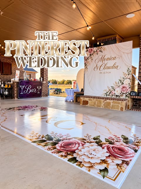
Inspired by our “The Pinterest Wedding” post, this guide looks beyond the moodboard and into production. Pinterest is useful for defining a visual direction: romantic scripts, warm neutrals, floral borders, elegant monograms or a coordinated backdrop. The saved image is a starting point for a conversation, not automatically artwork that can be printed.
The venue shown here brings several printed elements into one visual system: a white floor wrap with a gold border and monogram, large floral details, and a coordinated floral backdrop. The useful lesson is how repeated colors, flowers and typography connect separate surfaces without making every element identical.
Build a direction before building a file
Collect a small group of references that share one idea. Identify what repeats: color, type style, image treatment, shape and amount of empty space. Too many unrelated examples create conflicting instructions. Include a photo of the venue or planned display area so the design can respond to wood, draping, florals, lighting and surrounding signs.
Choose the photograph for print, not only for the phone screen
The best image has enough resolution, clear focus and room for the planned crop. Original camera files are preferable to screenshots or images downloaded from social media. A vertical portrait can fill a tall panel efficiently; a horizontal image may need a different board shape or intentional background extension. Keep faces, hands and important clothing details away from trim edges.
Create a readable information hierarchy
- Let the names be the first text guests recognize from normal walking distance.
- Use the date and welcome line as supporting information, with enough contrast against the background.
- Limit decorative typefaces to short phrases; use a cleaner face for longer wording.
- Leave calm space around every line so flowers, easels or nearby décor do not visually crowd it.
Prepare for production details
Confirm the final dimensions, board material, finish, cut shape and display method before approving the layout. Screen color and printed color can differ, and very thin lettering may lose clarity at large scale. Supply owned or properly licensed photos and graphic elements in the highest quality available. A production review should also check spelling, event date, crop, safe margins and whether the board needs an easel or another support.
How the quote process works
Choose the closest product and size, open its details, upload the available artwork or inspiration, and add the configuration to the quote cart. Submit the cart with the event information. Magic Prints For You reviews the request by email, confirms the exact scope and then sends the Square payment link for the approved amount.
A useful inspiration board communicates atmosphere. A successful printed board adds original design, correct files, readable type and production decisions that fit the real venue.